just want to see how this appears
Complimentary/Harmonious Colors
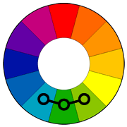
Using the color wheel, and if I got this right, this gallery should have a bit of harmonious flow to it…(click on the pictures for a better view)…

From dark red to light orange

Orange to yellow

yellow to green to blue

green to darker blue

blue to purple

purple to pink
Yes, no, maybe so?
What I learned this week:
I understand why using harmonious colors would be beneficial. They can either make your subject stand out more or blend in (like the wheat stalks vs the fish). They definitely make things more appealing to your eyes. I keep thinking about my “fashion sense” (or lack of). Or creating food dishes that makes your mouth water when you see it (think melted cheddar cheese and tomatoes). Or placing the photos on my wall in a different pattern, less of a mish mash, more harmonious.
I wanted to include this picture too.

The floral arrangement itself is a real beauty. Just look how they placed the flowers beside eachother, blending the lighter and darker hues together so it flows together, so they compliment eachother. And then to place it on a table with the Carribean Sea as the backdrop…the result is a mixture of art, design, and beauty.
For Cee’s Compose Yourself Challenge: Complimentary Colors
SL Week 35: Cook

Breakfast: scrambled eggs with peppers, marbled cheese, green onions and cherry tomatoes. Sprinkled with Italian seasoning and freshly cracked pepper. Delicious!
SL-Week 34: Trees
One of these trees is almost completely dead, except for the one branch that gives life to a small cluster of leaves on the very top. Upon closer inspection, they share the same root. Their limbs intertwine and support each other, much like a family does.
Black and White Weather

Raining

Snowing

Melting
A Photo a Week Challenge: Thirds Rule

Isolated cabin

Full moon

I do not know what this is, maybe a flower bud
Cee’s Compose yourself Challenge: Color Basics
I started off with this photo…

original, not too exciting

added some red for warmth, maybe too much

blue tint. I like this one
I took these, adjusting the camera’s white balance…


And began to have a bit of fun with these two…


.What I learned:
Most of my photos these days are being white-washed – there is too much white on white with the white skies and white snow. Adding a bit of color helps to create a bit more depth to them. This is also a time consuming process. I agonized over which photos to make adjustments too and how much of a tint they should have.
For Cee’s Compose Yourself Challenge: Color Basics
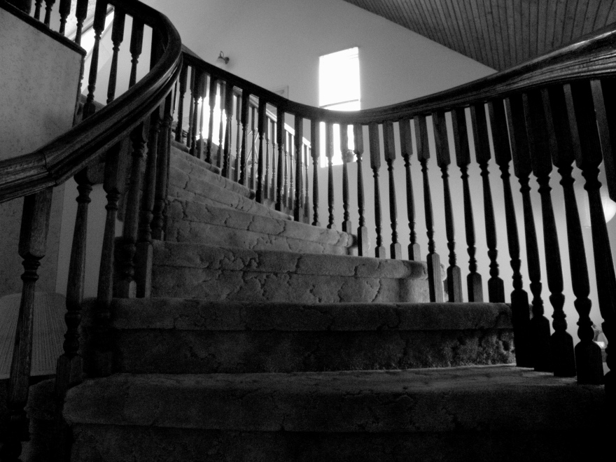
SL Week 33: Stairs
Sign at the Recycling Center

Hoar Frost

From across the driveway

On the tree tops

up close
Pretty, isn’t it?
